Expressing timestamp data in calendar
Unlike composing a text memos and keeping tracks of those, calendar graphics is a highly effective visual aid to taking notes and summarizing them. Well, we all have used calendar, one way or the other, in our lifetimes.
Calendar based graphics enables an accurate catch at the very first glance; For example, it is very easy relating one activity of a period to another when they are laid linearly with precise graduations. Calendar graphics does exactly that – some features (usually tiles) provide graduation, representing fixed interval of time (e.g., a day). This when combined with text allows unlimited freedom to provide narration for specific intervals.
In this post, I show how ggplot2’s graphics capabilities can be exploited while constructing an activity calendar. Some of the tidy-eval features are also borrowed and integrated to extend the flexibility of the function.
Any events referred to in this article is fully contrieved.
Discrete value mapping in calendar graphics
# a function to take calendar data and necessary arugments and spit a calendar plot
ggcal_spit <- function(year_month_day, calendar_data, date_column, activities_column){
  # year_month_day declares which month to construct calendar of
  # for example to refer to june: "2018-06-1"
  cdcol <- enquo(date_column)
  act <- enquo(activities_column)
  start <- as.Date(year_month_day)
  dates <- data.frame(date=seq(start, length.out=lubridate::days_in_month(start), by="1 day")) %>%
    mutate(weeknum = lubridate::week(date)-1, # or similar to lubridate::epiweek(): as.numeric(format(as.Date(date, format = "%Y-%m-%d"), "%U")),
           month = format(date, "%m"),
           weekday = factor(format(date, "%a"), levels=c("Mon", "Tue", "Wed", "Thu", "Fri", "Sat", "Sun")),
           day = format(date, "%d") %>% as.numeric()) %>%
    # given a pseudocalendar (datewise record of activities)
    # extract activities of the month specified in year_month_day
    mutate(Activities = calendar_data %>%
             filter(!!cdcol >= start, !!cdcol < start + lubridate::days(lubridate::days_in_month(start))) %>%
             pull(!!act) %>%
             str_wrap(width = 30))

  ggcal <- ggplot(dates, aes(x=weekday, y=weeknum)) +
    geom_tile(colour = "black", fill = "turquoise", alpha = 0.8) +
    geom_text(aes(label=day), size = 9, alpha = 0.5, color = "red", check_overlap = FALSE, nudge_y = -0.4) +
    geom_text(aes(label=Activities), size = 3.5, alpha = 1, color = "blue", check_overlap = FALSE) +
    scale_x_discrete(expand = c(0,0)) +
    theme(axis.ticks = element_blank()) +
    theme(axis.title.y = element_blank()) +
    theme(axis.title.x = element_blank()) +
    theme(panel.background = element_rect(fill = "transparent"))+
    theme(legend.position = "none") +
    theme()
  return(ggcal)
}
For example to generate calendar graphs for two months: January and February, we map the data over dates specifying those two months in some way.
# import calendar data
calendar <- read_csv("./data/Calendar_of_activities_year_xy.csv") %>%
    mutate(Date_eng = as.Date(Date_eng, "%d-%b-%y")) %>%
    mutate(Date_eng_start = as.Date(Date_eng, "%d-%b-%y"),
        Date_eng_end = Date_eng_start + lubridate::days(1))

# generate a ggplot list object of calender
month_calendar <- purrr::map(.x = seq.Date(as.Date("2018-01-01"),
    by = "month", length.out = 2), .f = ~ggcal_spit(.x,
    calendar_data = calendar, date_column = Date_eng,
    activities_column = Activity1))

walk(month_calendar, print)

# # save all monthly calendars as png image
# purrr::walk2(.x =
# paste('Calendar_of_activities_', month.abb[1:2],
# '_2018', '.png', sep = ''), .y = month_calendar,
# .f = ~ggsave(.x, plot = .y, device = 'png', width
# = 12, height = 8, units = 'in', dpi = 250))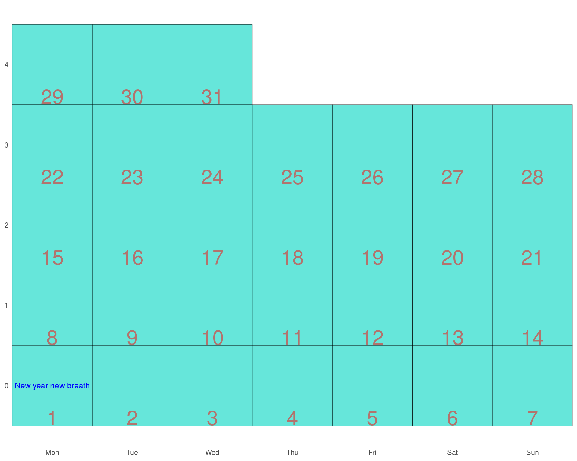
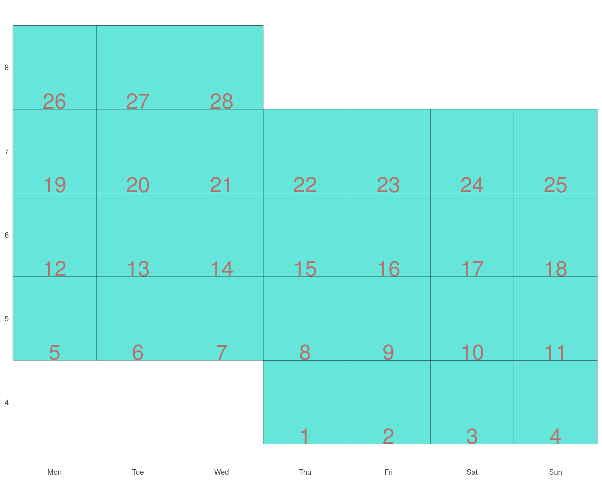
Note that calendar weekdays start at monday, but this might be misleading in some instances so a few other tweaks are required.
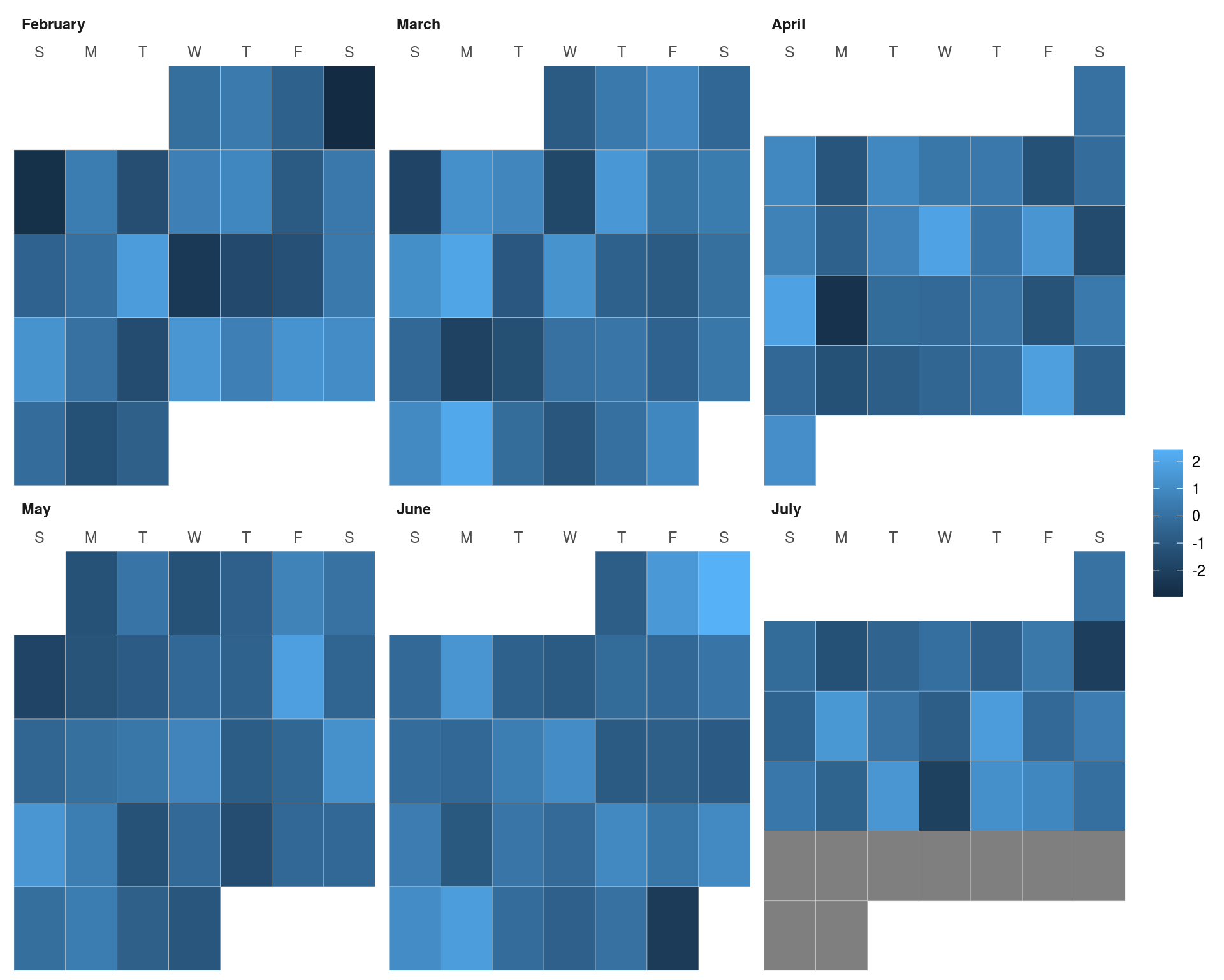
Numeric value mapping in calendar graphics
mydate <- seq(as.Date("2017-02-01"), as.Date("2017-07-22"), by="1 day")
myfills <- rnorm(length(mydate))

ggcal <- function(dates, fills) {
  # get ordered vector of month names
  months <- format(seq(as.Date("2016-01-01"), as.Date("2016-12-01"), by="1 month"), "%B")

  # get lower and upper bound to fill in missing values
  mindate <- as.Date(format(min(dates), "%Y-%m-01"))
  maxdate <- (seq(as.Date(format(max(dates), "%Y-%m-01")), length.out = 2, by="1 month")-1)[2]
  # set up tibble with all the dates.
  filler <- tibble(date = seq(mindate, maxdate, by="1 day"))

  t1 <- tibble(date = dates, fill=fills) %>%
    right_join(filler, by="date") %>% # fill in missing dates with NA
    mutate(dow = as.numeric(format(date, "%w"))) %>%
    mutate(month = format(date, "%B")) %>%
    mutate(woy = as.numeric(format(date, "%U"))) %>%
    mutate(year = as.numeric(format(date, "%Y"))) %>%
    mutate(month = factor(month, levels=months, ordered=TRUE)) %>%
    arrange(year, month) %>%
    mutate(monlabel=month)

  if (length(unique(t1$year))>1) { # multi-year data set
    t1$monlabel <- paste(t1$month, t1$year)
  }

  t2 <- t1 %>%
    mutate(monlabel = factor(monlabel, ordered=TRUE)) %>%
    mutate(monlabel = fct_inorder(monlabel)) %>%
    mutate(monthweek = woy-min(woy),
           y=max(monthweek)-monthweek+1)

  weekdays <- c("S", "M", "T", "W", "T", "F", "S")
  ggplot(t2, aes(dow, y, fill=fill)) +
    geom_tile(color="gray80") +
    facet_wrap(~monlabel, ncol=3, scales="free") +
    scale_x_continuous(expand=c(0,0), position="top",
                       breaks=seq(0,6), labels=weekdays) +
    scale_y_continuous(expand=c(0,0)) +
    theme(panel.background=element_rect(fill=NA, color=NA),
          strip.background = element_rect(fill=NA, color=NA),
          strip.text.x = element_text(hjust=0, face="bold"),
          legend.title = element_blank(),
          axis.ticks=element_blank(),
          axis.title=element_blank(),
          axis.text.y = element_blank(),
          strip.placement = "outsite")
}

print(ggcal(mydate, myfills))