Design and analysis of spit plot experiments
Split plot design
Design and fieldbook template
In a field experiment to test for effects of fungicide on crop, treatment of fungicides may be distinguised into multiple factors – based on chemical constituent, based on formulation, based on the mode of spray, etc. In a general case scenario where two former factors could be controlled, factor combinations may be organized in several different ways. When fully crossed implementation is not possible, split plot design comes to the rescue.
It is fair to assume that fungicide constituent is relatively difficult to allocate in highly isolated patches, so we can allocate a larger plot parcel to this factor and allocate different levels of formulation to sub-plots.
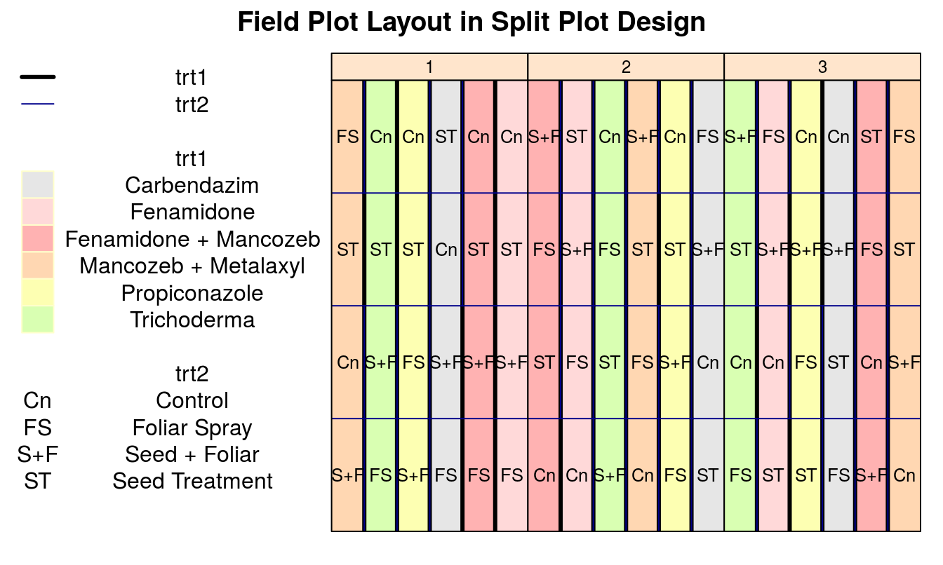
The design fieldbook seems somewhat similar to that shown in Table 1.
| plots | splots | block | trt1 | trt2 | mainplot |
|---|---|---|---|---|---|
| 101 | 1 | 1 | Mancozeb + Metalaxyl | Seed + Foliar | 1 |
| 101 | 2 | 1 | Mancozeb + Metalaxyl | Control | 1 |
| 101 | 3 | 1 | Mancozeb + Metalaxyl | Seed Treatment | 1 |
| 101 | 4 | 1 | Mancozeb + Metalaxyl | Foliar Spray | 1 |
| 102 | 1 | 1 | Trichoderma | Foliar Spray | 2 |
| 102 | 2 | 1 | Trichoderma | Seed + Foliar | 2 |
| 102 | 3 | 1 | Trichoderma | Seed Treatment | 2 |
| 102 | 4 | 1 | Trichoderma | Control | 2 |
Layout plan
An example grid layout plan of the aboveshown design is shown below.
Analyis of split plot design
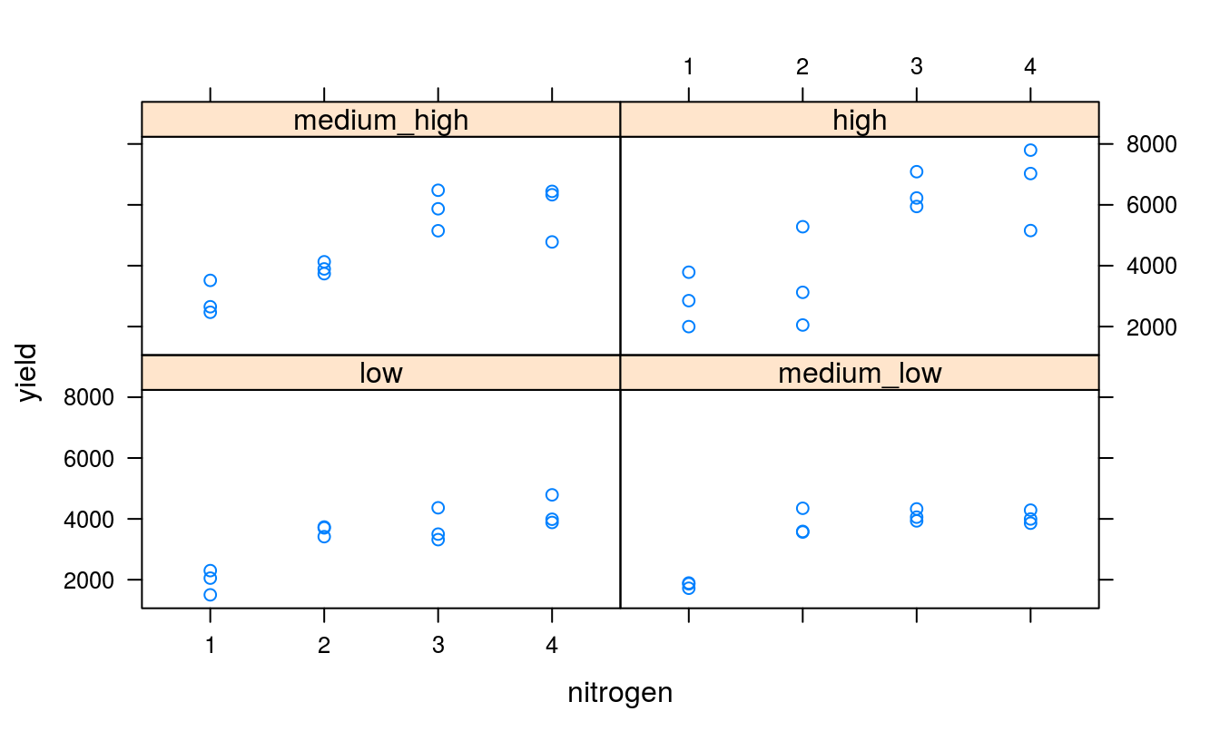
Let us take a grain yield dataset. The dataset contains 48 observations. Below, (in Table 2) data head have been shown after import, type-conversion and factor recoding.
| rep | density | nitrogen | yield |
|---|---|---|---|
| 1 | low | 1 | 1503 |
| 1 | medium_low | 1 | 1866 |
| 1 | medium_high | 1 | 2469 |
| 1 | high | 1 | 3786 |
| 2 | low | 1 | 2299 |
| 2 | medium_low | 1 | 1892 |
| 2 | medium_high | 1 | 3517 |
| 2 | high | 1 | 2851 |
Calculating variance, and setting hypothesis: A case involving single factor
In the most primitive scenario, manual calculation of variance components could just as easily be done. However, as the number of treatment factors rise, so does the complexity of computation. Manual calculation of sum of squares and the test statistic could be done as shown below. This, however, only remains valid as long as no grouping factors besides nitrogen are present, thus making it a classical scenario of single factor variance partitioning.
mu <- mean(grain_yld$yield)  # whole sample mean
ssto <- sum((grain_yld$yield - mu)^2)  # total sum of squares
mu.i <- tapply(grain_yld$yield, grain_yld$nitrogen,
    mean)  # nitrogen(factor) means
sstr <- sum(table(grain_yld$nitrogen) * (mu.i - mu)^2)  # nitrogen(factor) sum of squares
sse <- ssto - sstr  # error sum of squares
fstat <- (sstr/3)/(sse/45) # F-statistic| Source | Sums of Squares | Degrees of Freedom | Mean Square | F-Stat | p-value |
|---|---|---|---|---|---|
| Treatment | 6.167^{7} | 3 | 2.056^{7} | 18.465 | 5.925^{-8} |
| Error | 5.01^{7} | 45 | 1.113^{6} |
\[ \begin{align*} H_0 & : \mu_1 = \mu_2 = \mu_3 \\ H_A & : \mbox{At least one pair of means not equal} \end{align*} \]
Before proceeding for an inference, It is worthwhile to be acquainted with what the distribution looks like.
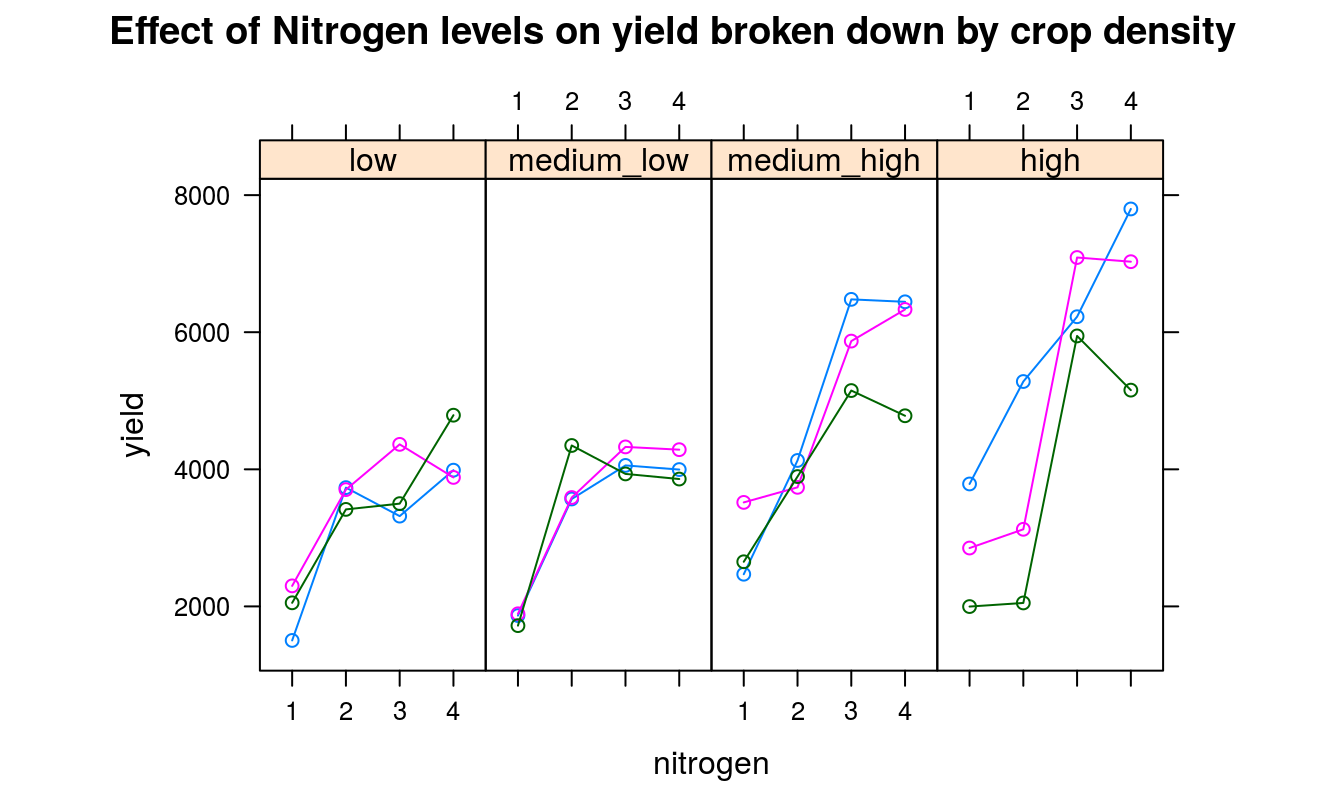
Getting back to our specific split-plot design case, we develop model and generate the ANOVA table (Table 3). A split plot design is modeled with main plot factor nested within replication and a sub plot factor nested within main plot factor. This essentially partitions the main effects of replication and the main plot factor.
| Df | Sum Sq | Mean Sq | F value | Pr(>F) | |
|---|---|---|---|---|---|
| rep | 2 | 3413766 | 1706883 | 5.98 | 0.008 |
| density | 3 | 21451719 | 7150573 | 25.05 | 0.000 |
| rep:density | 6 | 6576455 | 1096076 | 3.84 | 0.008 |
| density:nitrogen | 12 | 73482134 | 6123511 | 21.45 | 0.000 |
| Residuals | 24 | 6849756 | 285406 |
Alternatively, following model specification could be made by regarding response (yield) as a product of main plot effect and sub plot effect, wherein main plot is nested inside replication (block) (ANOVA shown in Table 4).
| Df | Sum Sq | Mean Sq | F value | Pr(>F) | |
|---|---|---|---|---|---|
| density | 3 | 21451719 | 7150573 | 25.05 | 0.000 |
| nitrogen | 3 | 61673305 | 20557768 | 72.03 | 0.000 |
| rep | 2 | 3413766 | 1706883 | 5.98 | 0.008 |
| density:nitrogen | 9 | 11808829 | 1312092 | 4.60 | 0.001 |
| density:rep | 6 | 6576455 | 1096076 | 3.84 | 0.008 |
| Residuals | 24 | 6849756 | 285406 |
It should be the right time, now, to use plotting libraries and generate some beautiful graphs.
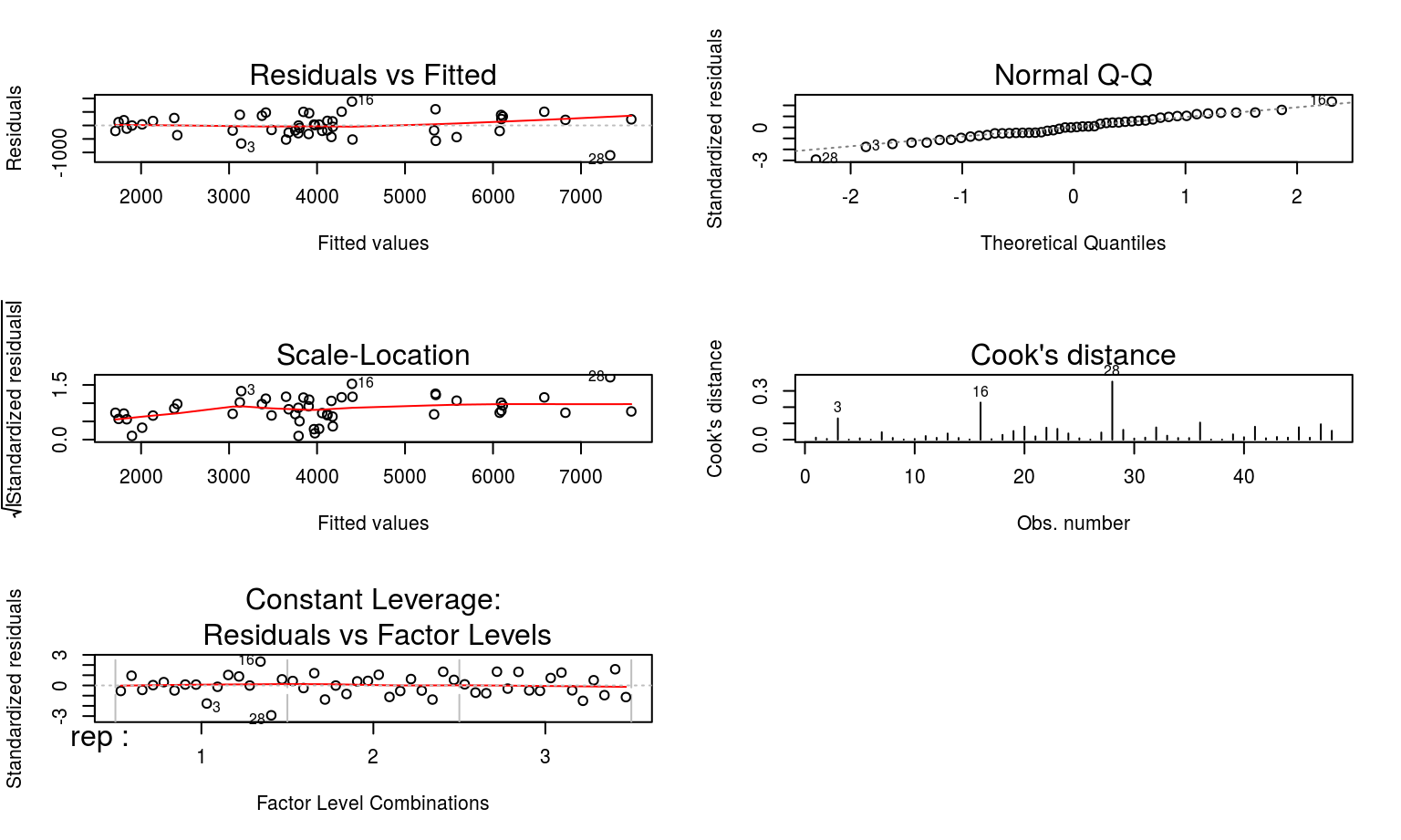
Best to take a look at some diagnostic plots now, just to make sure model assumptions and validity are not being flouted.
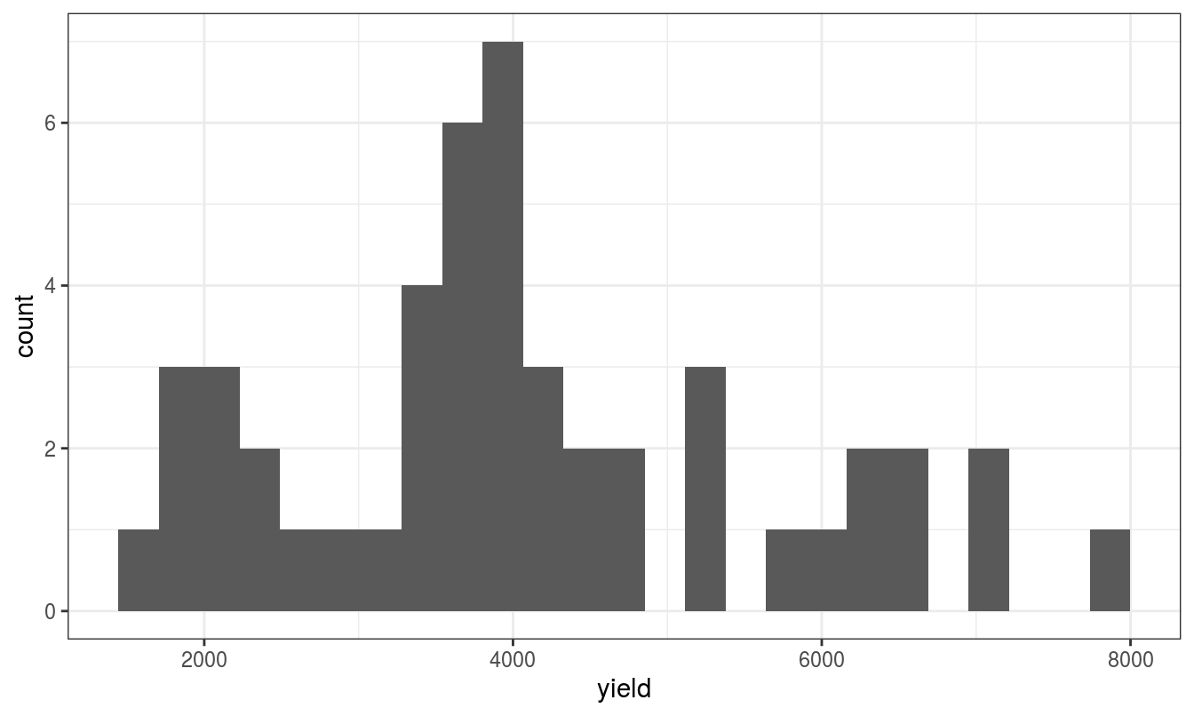
Box-Cox plots helps determine whether or not a transformation is required. To recapitulate the importance of Box-Cox plot, below is an statement quoted from http://www.itl.nist.gov/div898/handbook/eda/section3/eda336.htm, which goes:
The Box-Cox normality plot shows that the maximum value of the correlation coefficient exists at λ = (x-axis value | maximum y-axis height). The histogram of the data after applying the Box-Cox transformation(were it not indicative of normal) with λ = (x-axis value | maximum y-axis height) shows a data set for which the normality assumption is reasonable. This can be verified with a normal probability plot of the transformed data.
![]()
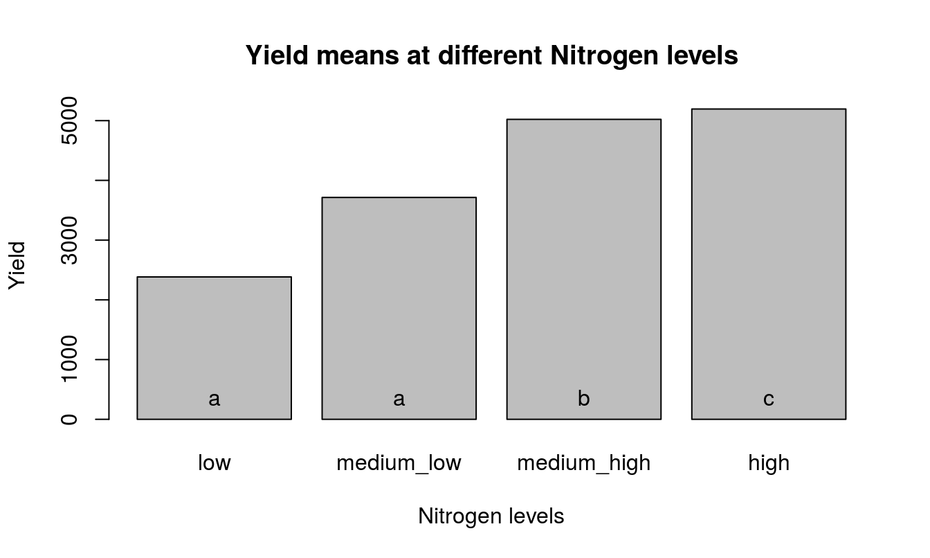
Mean separation should proceed as follows.
##
## Study: Duncan multiple comparison among levels of nitrogen
##
## Duncan's new multiple range test
## for yield
##
## Mean Square Error:  285406
##
## nitrogen,  means
##
##   yield  std  r  Min  Max
## 1  2384  710 12 1503 3786
## 2  3714  757 12 2050 5281
## 3  5021 1268 12 3317 7090
## 4  5195 1367 12 3858 7798
##
## Alpha: 0.05 ; DF Error: 24
##
## Critical Range
##   2   3   4
## 450 473 487
##
## Means with the same letter are not significantly different.
##
##   yield groups
## 4  5195      a
## 3  5021      a
## 2  3714      b
## 1  2384      c
Visualize the means resulting from Duncan’s test.